_edited.png)
Vision & Mission Statements
Vision
To be India's most trusted and technology-enabled EXIM logistics partner, setting the benchmark for reliability, transparency, and predictable execution in port-led container transportation.
Mission
We deliver predictable, accountable, and technology-driven EXIM trucking solutions that remove complexity from port-to-door logistics. Through our GPS-enabled modern fleet, deep port expertise, and 24/7 customer support, we provide end-to-end visibility and consistent on-time performance — enabling exporters and importers to operate with confidence, control costs, and plan with certainty.
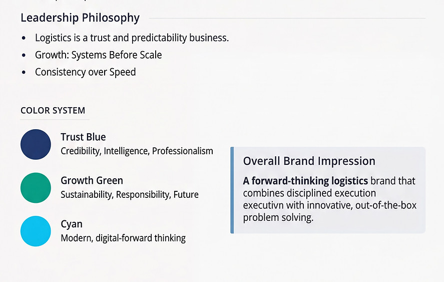
Core Values
-
Accountability — We own every shipment from start to finish
-
Transparency — Real-time tracking and clear communication, always
-
Reliability — Consistent performance you can plan around
-
Innovation — Technology-driven solutions for modern logistics
-
Partnership — We're your logistics partner, not just a vendor
Visual Identity
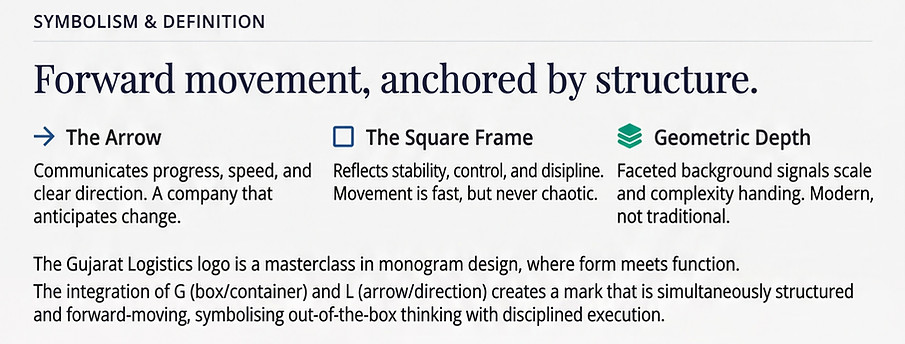
Our visual identity is a reflection of how Gujarat Logistics operates every day — with clarity, structure, and forward intent.
Every element of the brand has been designed with purpose. The mark, the colors, and the geometry work together to communicate movement anchored by discipline. This is not design for decoration, but design that mirrors real-world execution across ports, highways, and supply chains. The logo represents direction, reliability, and out-of-the-box thinking within a strong operational framework. The color system reinforces trust, growth, and modern, digital-first logistics. Together, they create an identity that is contemporary, confident, and built for scale.
This section explains the thinking behind the visuals — not just how the brand looks, but what it stands for.
_edited.png)
Brand Characteristics
Forward-Looking Anticipating demands; tech-aware and prepared.
Modern & Professional Contemporary management, distancing from "transport" tropes.
Reliable & Structured Process strength and consistency are non-negotiable.